
ZOOMER
PROJECT OVERVIEW
Transform an outdated, print-inspired website into a modern, digital-first experience that reflects the brand’s evolution and meets current web and accessibility standards.
My Role
Senior UX/UI Designer
Team
Worked closely with our Editor in Chief Chief Revenue Officer, Vice President of Digital, Magazine Editors, Magazine Executive Creative Director, and Magazine Art Directors
Timeline
January - June 2025
Tools Used
Designs / Mockups done in Figma
CHALLENGE
The previous EverythingZoomer.com site had not been significantly updated in several years, resulting in a digital experience that no longer aligned with current web usability standards or user expectations. As the brand transitioned from a print-based magazine to a fully digital publication, the website needed to become the primary medium for content delivery, engagement, and monetization.
Key problems identified:
• Outdated interface and navigation made content difficult to discover.
• Not optimized for mobile — poor readability and usability on smaller screens.
• Slow load times and technical debt from legacy code and CMS structure.
• Branding and visuals still heavily tied to the print magazine identity, not reflective of a modern digital publication.
• Limited accessibility compliance (didn’t meet WCAG 2.1 standards).
• Advertising and partnership opportunities constrained by the old site structure.
• The transition to a fully digital platform required the integration of a seamless login flow and a robust subscription management system.
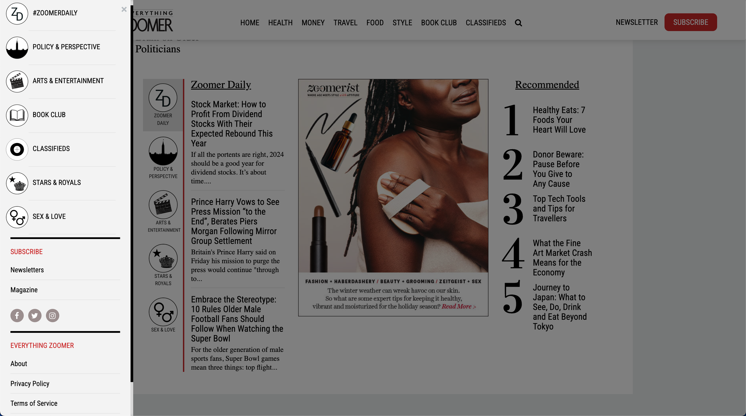
Everything Zoomer’s very cluttered navigation and page designs

Everything Zoomer’s jarring mobile experience
WHAT SUCCESS WOULD LOOK LIKE?
1. User Experience Success
Intuitive navigation and improved readability across devices.
Seamless login and subscription flow that builds trust and engagement.
Accessible interface optimized for Zoomer’s 45+ audience.
2. Business / Editorial Success
Growth in digital subscriptions and newsletter sign-ups.
Increased session duration and reduced bounce rates.
Streamlined publishing process for the editorial team.
3. Brand & Strategic Success
Stronger digital identity reflecting the brand’s shift from print to online.
Consistent, modern visual language across the site.
Competitive positioning alongside other lifestyle media outlets.
4. Technical & Performance Success
Faster load times and improved mobile performance.
Full compliance with WCAG 2.1 accessibility standards.
Scalable CMS ready for future growth.


RESEARCH & DISCOVERY
To guide the redesign of Zoomer.com, I began by conducting a mix of stakeholder interviews, data analysis, and competitive benchmarking. This helped uncover usability gaps, content performance trends, and audience expectations for a modern lifestyle publication.
1. Stakeholder Interviews
I interviewed key members of the magazine and digital teams — including editors, marketing leads, and content producers — to understand both editorial goals and pain points within the existing workflow.
Key insights from stakeholders:
• The current CMS made publishing time-consuming, often requiring duplicate uploads or manual formatting.
• Editors wanted more control over how stories were featured on the homepage.
• The brand needed a site that could better support advertising, newsletters, and digital subscriptions.
2. User Research & Analytics Review
To understand how readers were engaging with the old EverythingZoomer.com site, I analyzed Google Analytics and social engagement data from the past 12 months.
Key findings included:
• High mobile traffic (≈68%) but poor mobile usability scores — indicating a need for responsive redesign.
• Bounce rate above 70%, especially on article pages, suggesting layout and readability issues.
• Average session duration under 1 minute, implying low engagement and content stickiness.
• Top content categories: Health, Money, and Travel consistently drove the highest page views.
• Search behaviour: Users frequently searched for practical guides (“retirement tips,” “healthy aging”) but had difficulty locating them through navigation.
These findings pointed to a strong appetite for content — but a poor experience delivering it.
3. Competitive Analysis
I benchmarked Zoomer.com against other established lifestyle media brands targeting similar demographics, including AARP, NextAvenue, and Reader’s Digest.
Observations:
• Competitors use simplified navigation and clear category hierarchies.
• Homepage layouts highlight trending and evergreen content, balancing editorial storytelling with utility.
• Visual design relies on large, legible type and minimal clutter — enhancing readability for older audiences.
• Integrated subscription prompts and community features encourage ongoing engagement.
This analysis clarified how Zoomer.com could position itself as both familiar and forward-thinking — modern without alienating its existing audience.

What Insights Did We Gain?
From this research, several actionable insights shaped the redesign strategy:
1. Accessibility and readability are critical
The audience values clear typography, strong color contrast, and predictable navigation.
2. Mobile-first design is non-negotiable
With nearly 70% of traffic coming from smartphones, the experience needed to be fluid across screen sizes.
3. Content discoverability drives engagement
Users want quick access to popular topics and recent stories without navigating deep menus.
4. A modern CMS empowers the editorial team
Simplifying publishing workflows and allowing for flexible content layouts would directly improve operational efficiency.
5. The brand must evolve visually
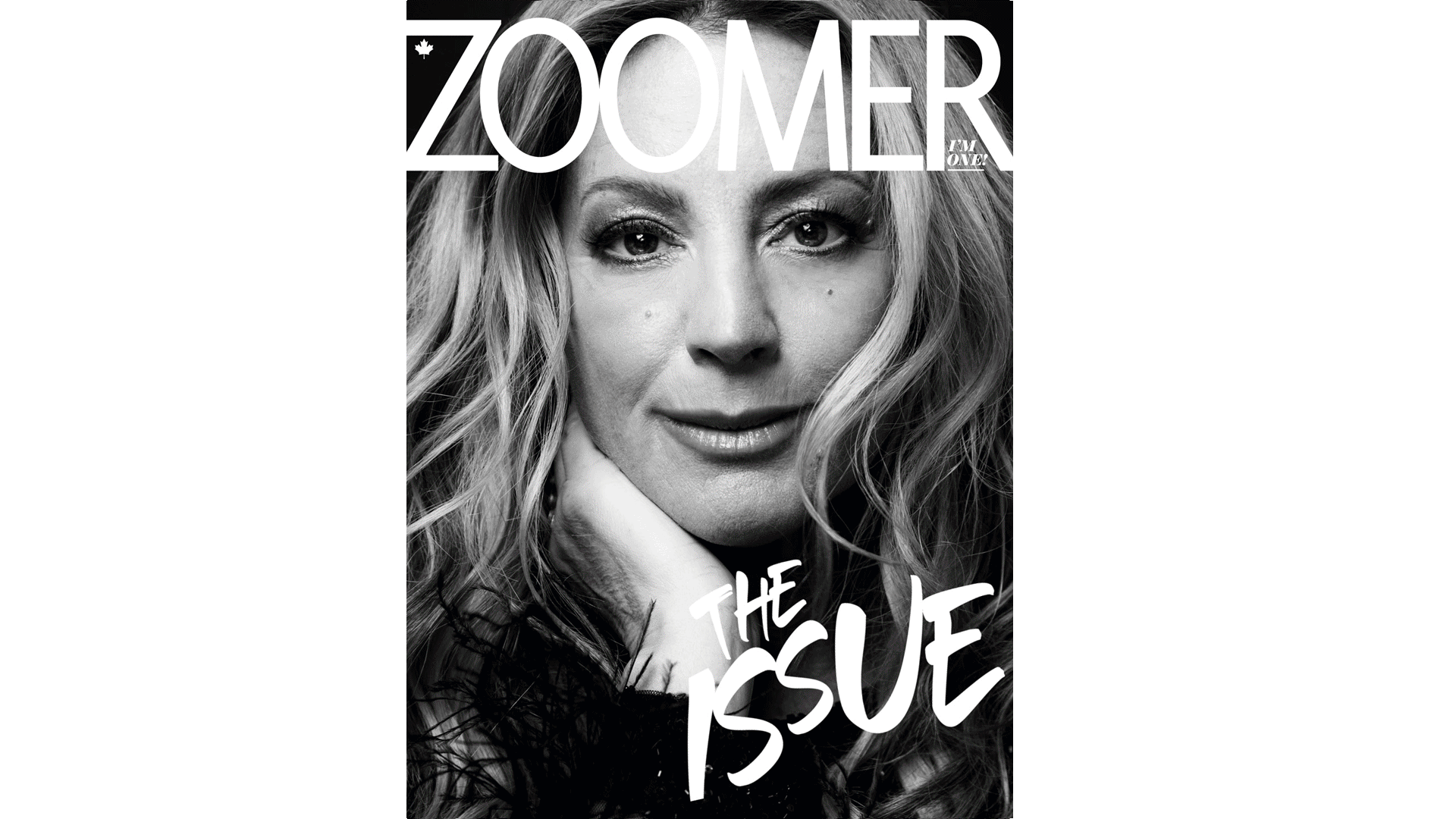
Readers should immediately recognize the site as Zoomer, not EverythingZoomer, signaling its new digital-first identity.

User Personas
Following our research and analysis of key user pain points, we developed a set of simple user personas to guide our solution and ensure it addressed the needs and behaviours of our core audiences.

IDEATION & DESIGN PROCESS
After reviewing research insights and defining user goals, I audited the existing EverythingZoomer.com site, uncovering key design issues: outdated navigation, cluttered layouts, poor mobile responsiveness, and inconsistent typography.
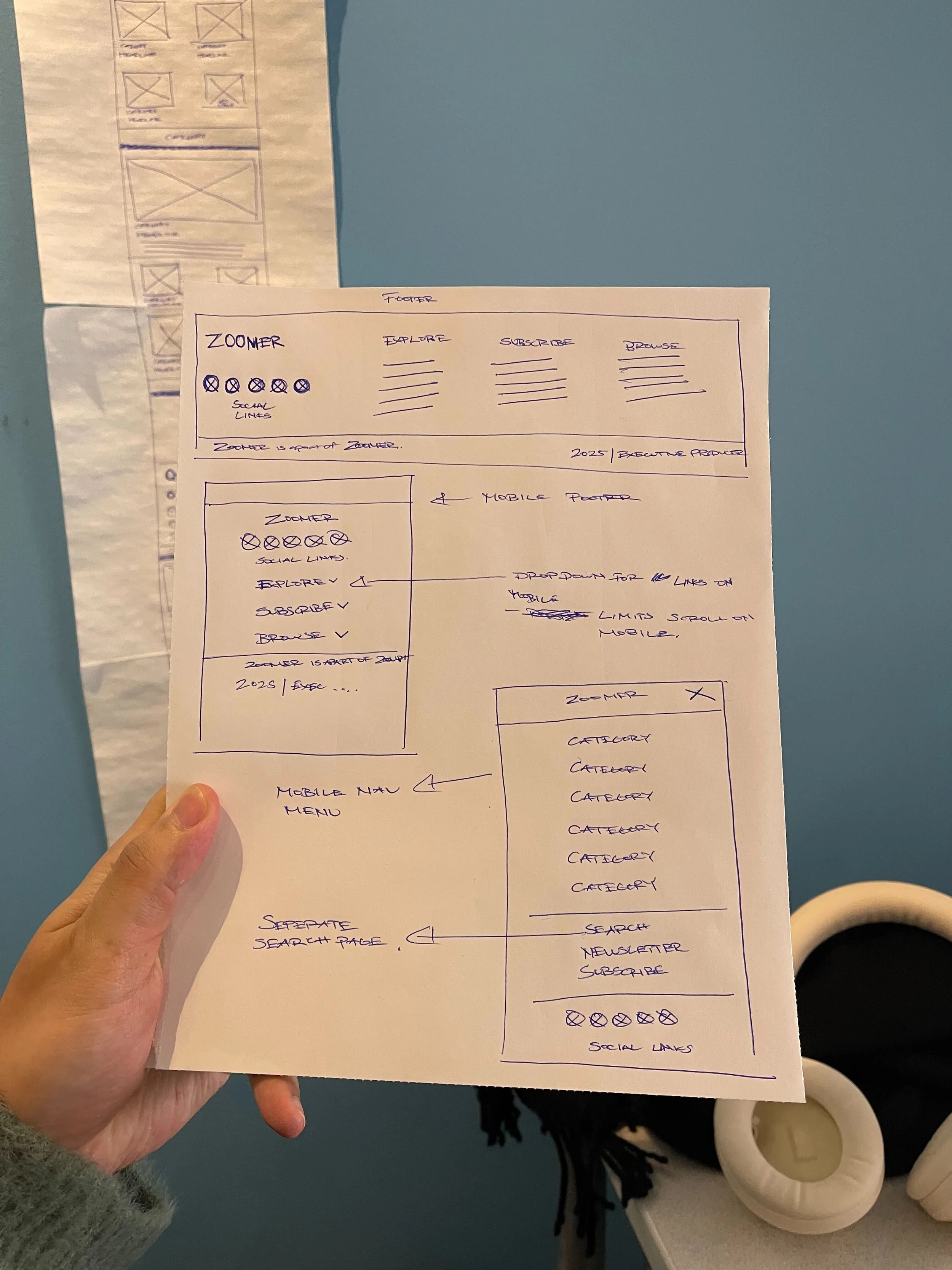
I started with hand-drawn sketches to reimagine content hierarchy and navigation, then moved into Figma to create greyscale wireframes focused on layout, readability, and core functionality. Iterating closely with stakeholders and developers ensured the design balanced user needs, editorial priorities, and technical feasibility.

Key Design Decisions
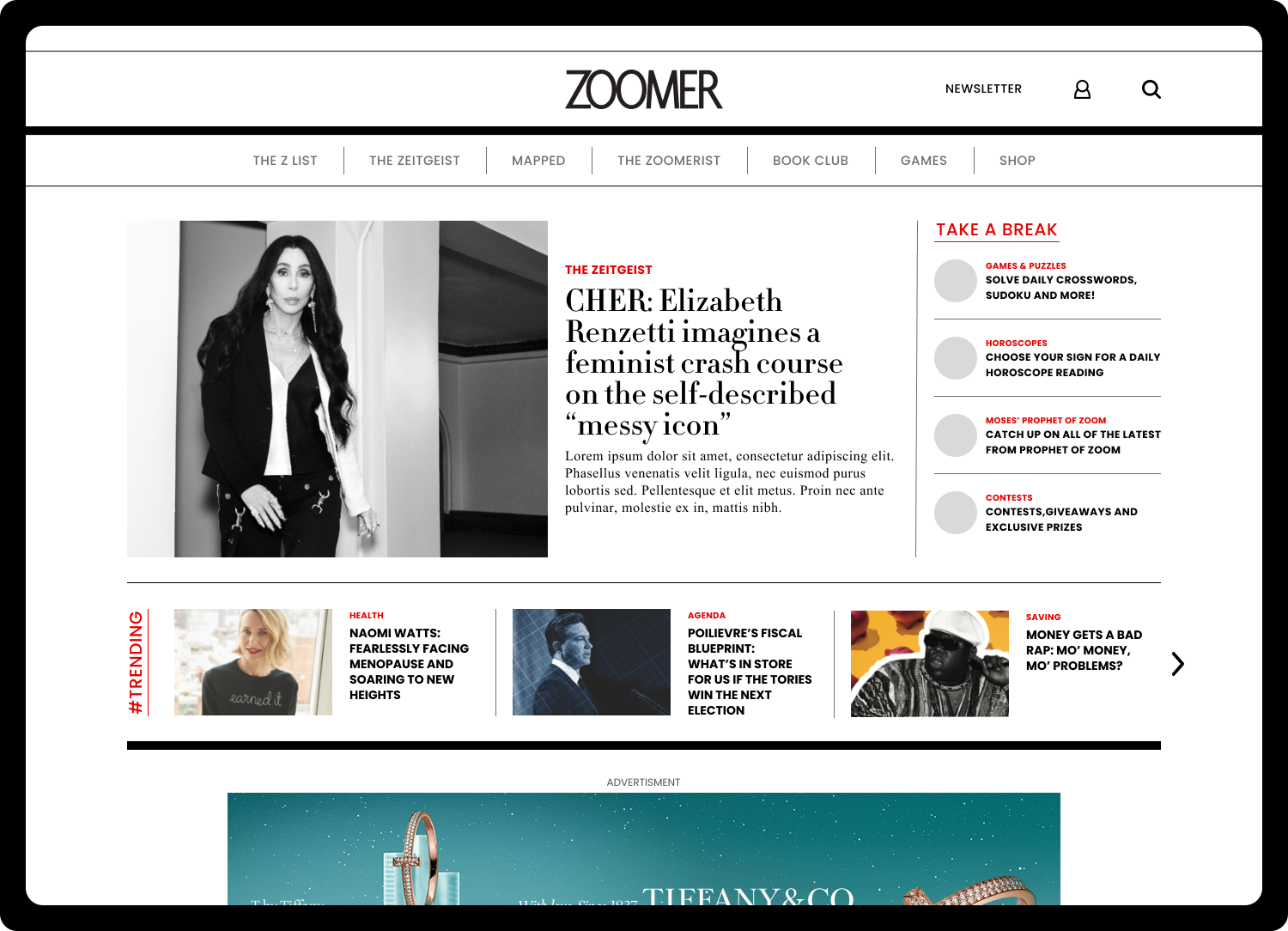
Once the greyscale wireframes were validated with the team, I transitioned into high-fidelity design — focusing on visual hierarchy, color, and typography to bring the new Zoomer brand to life within a clean, modern interface.
1. Updated Navigation
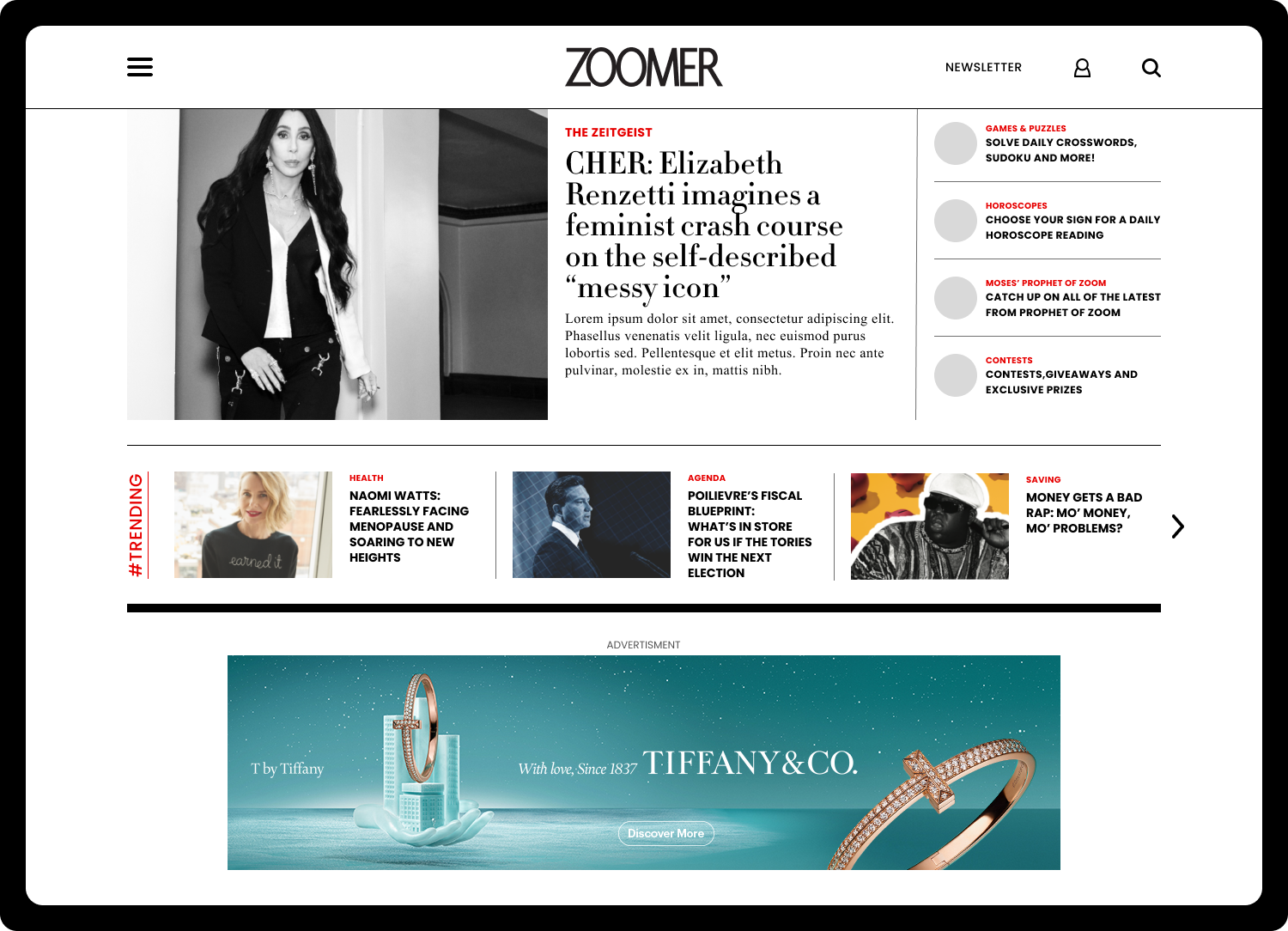
Redesigned the site’s navigation to be clean, uncluttered, and consistent across all devices.
On desktop, the navigation bar now minimizes on scroll, maximizing screen space for content.


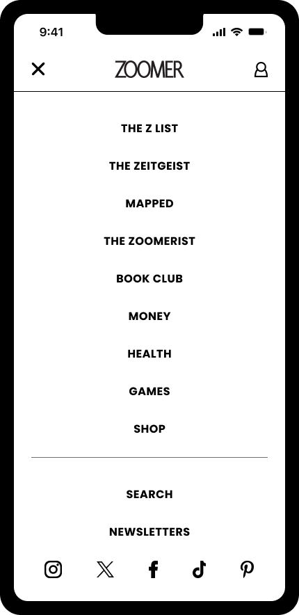
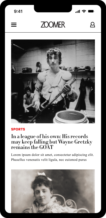
2. Mobile-First Experience
Prioritized mobile design to ensure a seamless and enjoyable experience for users on any device.
Streamlined interactions and layouts for easy browsing and reading on smaller screens.


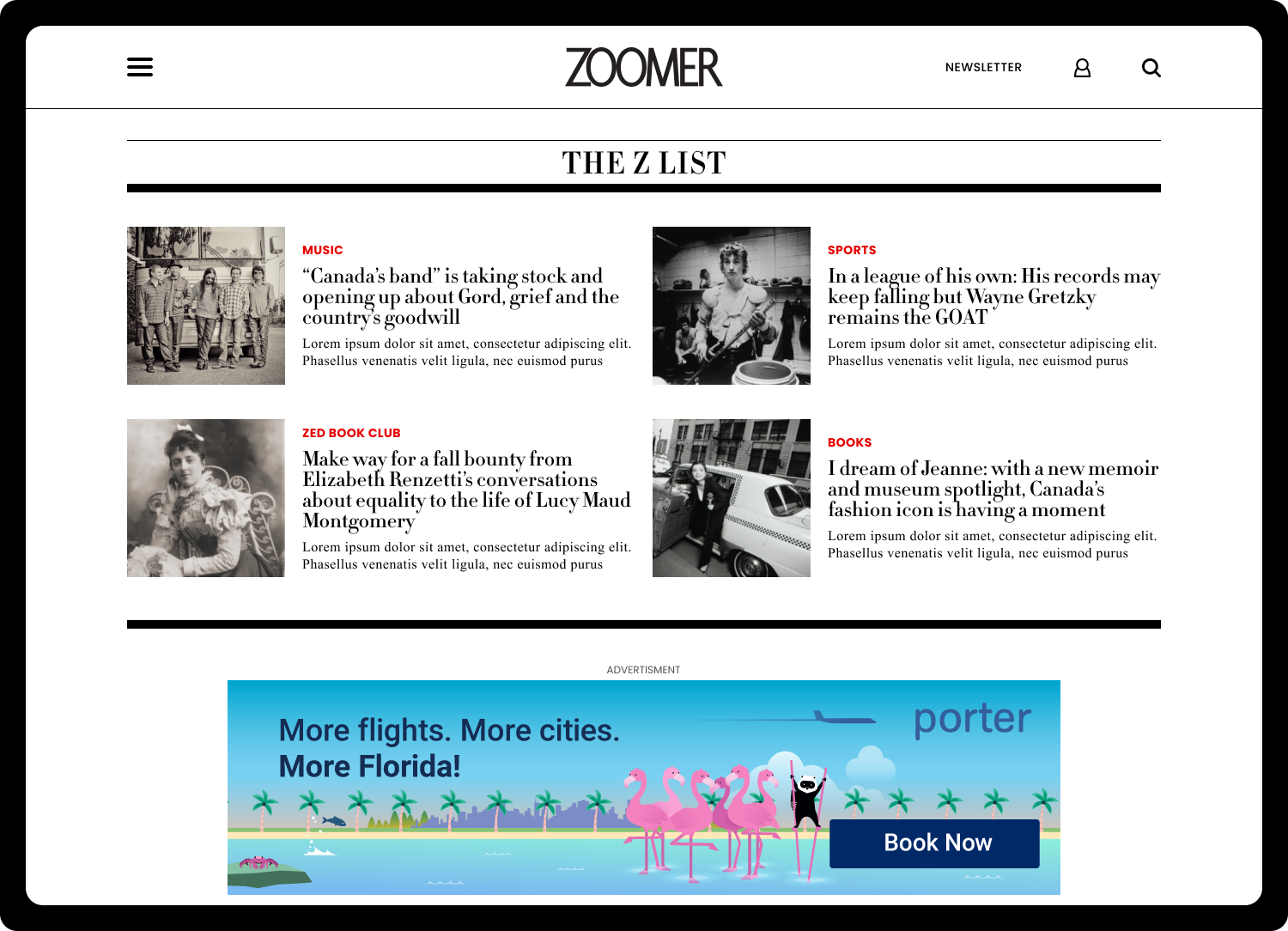
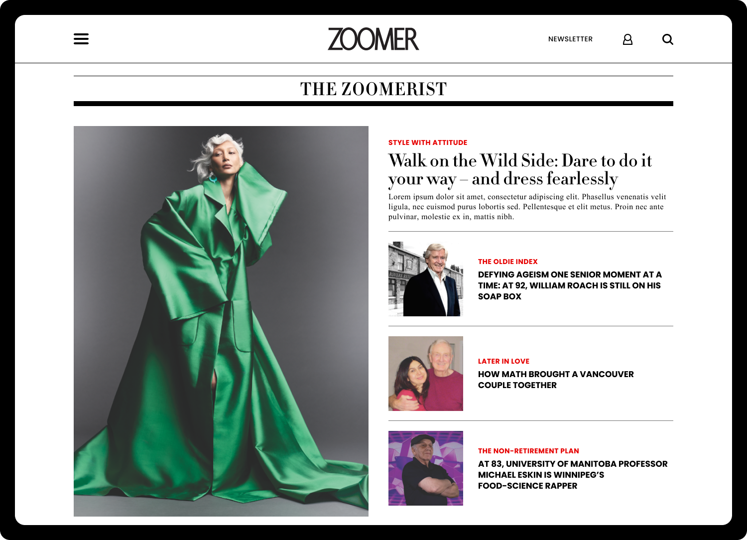
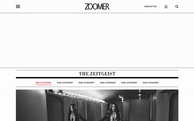
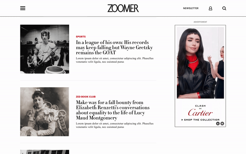
3. Home Page Layout
Introduced modular cards and flexible layouts to highlight Zoomer’s diverse content.
Simplified design eliminates clutter, providing a clear, visually appealing entry point to the site.

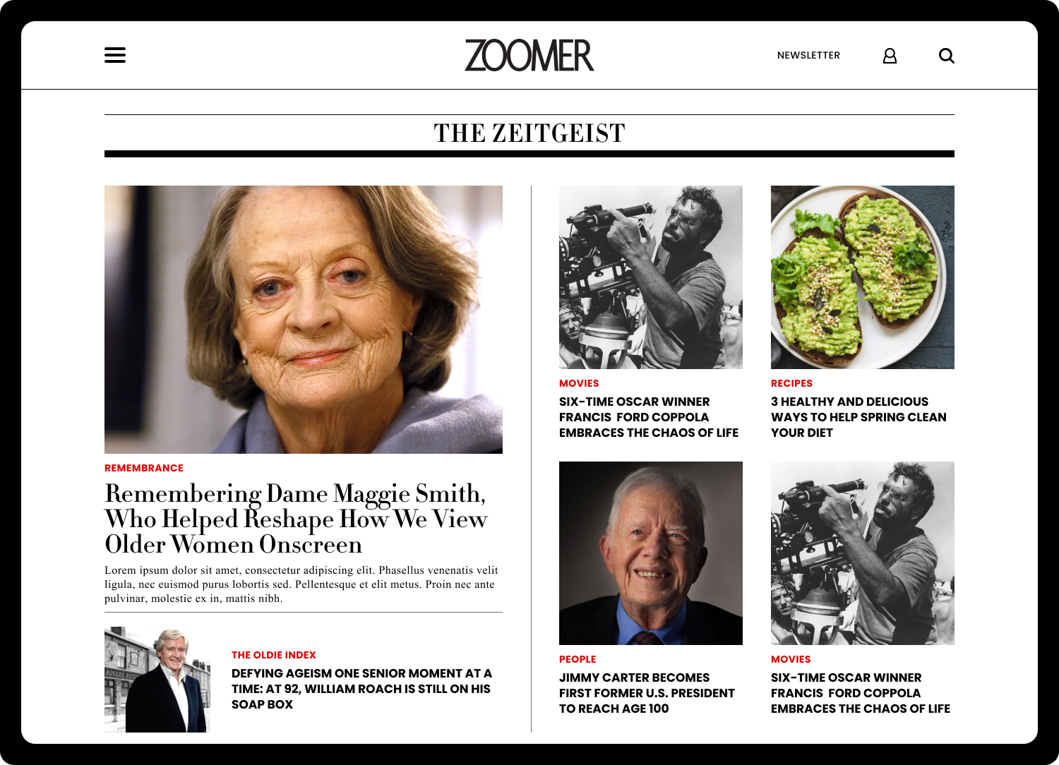
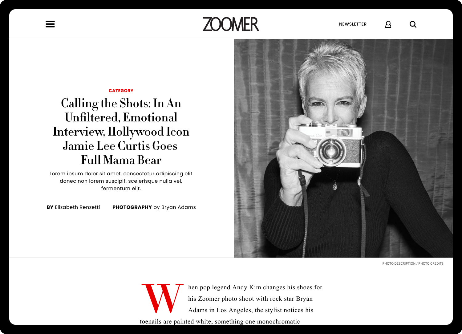
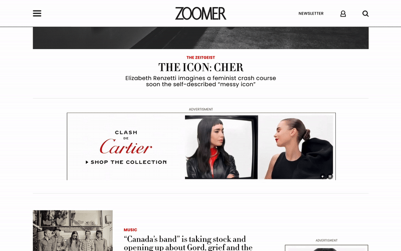
4. Article Styles & Content Hierarchy
Developed distinct article layouts to differentiate free and premium content.
Paywalled content features larger imagery and emphasis on subscription value, while free content maintains a clean, readable layout.


5. Ad Revenue Placement
Designed strategic ad placements to support monetization in the fully digital model.
Incorporated traditional display ads alongside high-impact formats like video and GIF ads for better engagement.
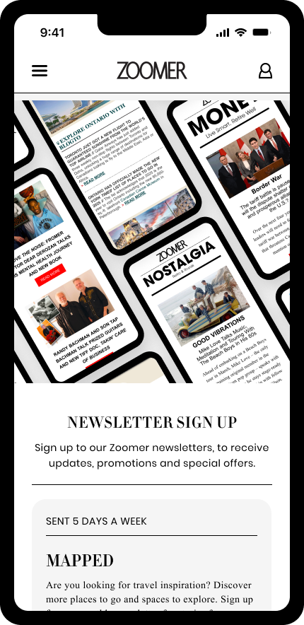
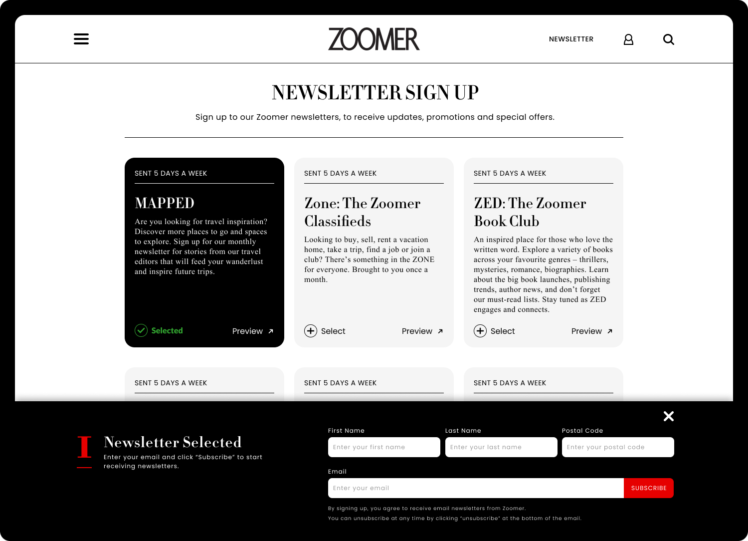
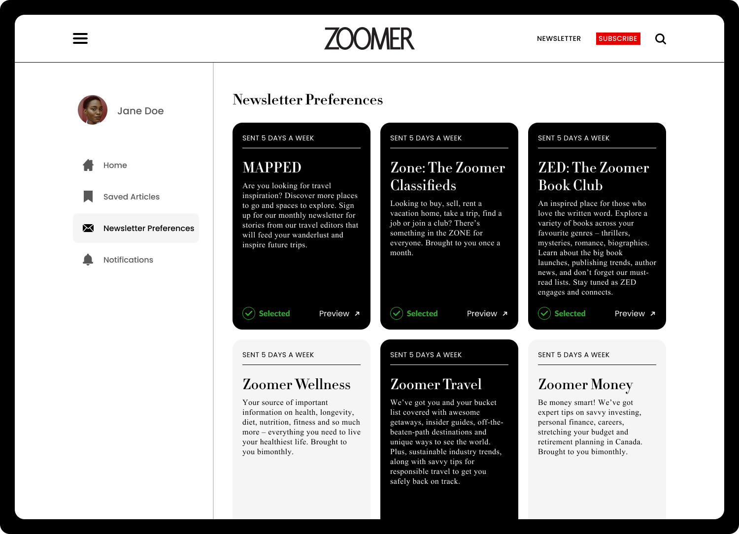
6. Newsletter CTAs & Sign-Up Flow
Overhauled the newsletter system to increase subscriptions and drive engagement.
Redesigned sign-up pages and embedded CTAs ensure users are aware of Zoomer’s digital offerings.


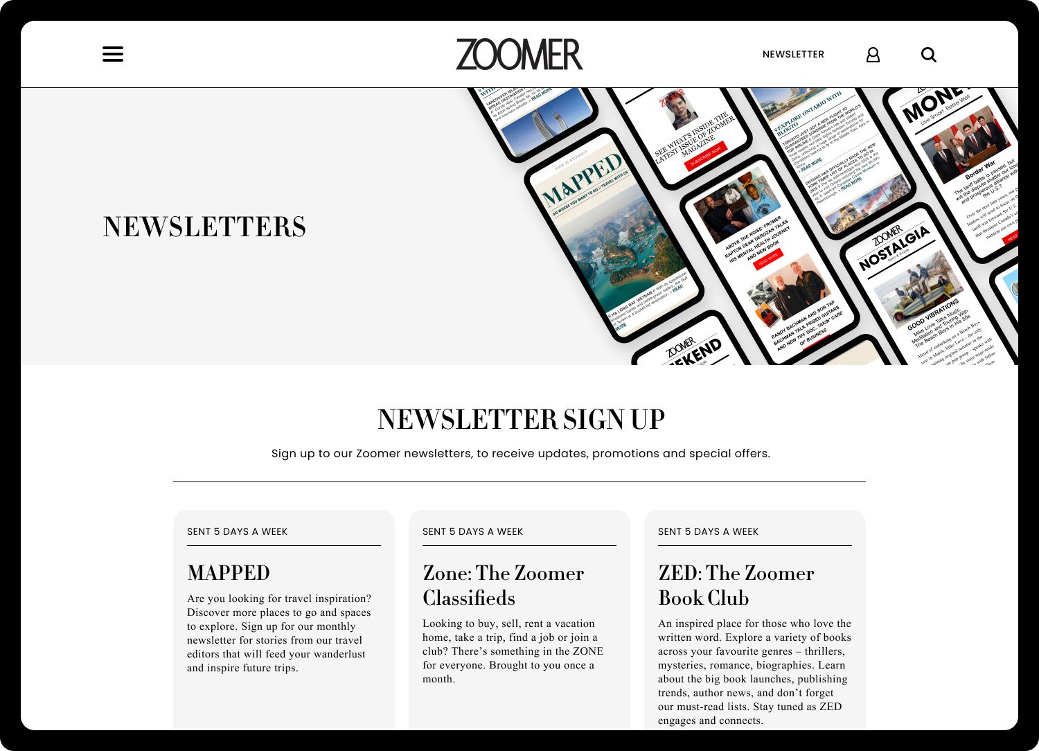
7. Sister Brand Updates
Updated Zoomer’s sister properties, including Zone and The Zoomer Book Club, to align visually and functionally with the main redesign.


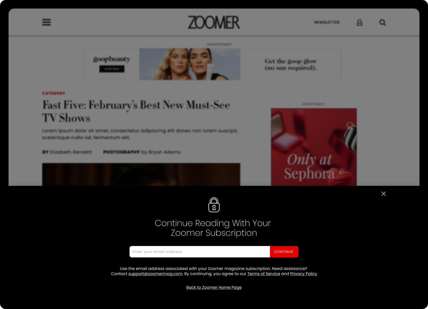
8. Paywall System
Introduced a new paywall system with article overlays prompting users to subscribe.
Carefully designed to balance user engagement with conversion goals.

9. Account Creation & Onboarding
Built a streamlined account creation process integrated with the paywall system.
Designed an onboarding experience highlighting subscription perks and allowing users to customize preferences and newsletters.


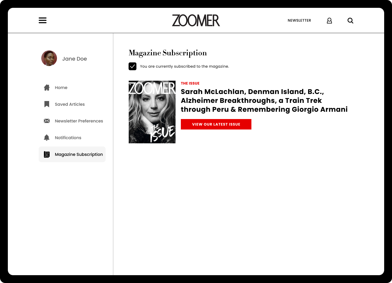
10. User Dashboard
Created a comprehensive dashboard for managing subscriptions, preferences, and account settings.
Focused on intuitive navigation and clear presentation of user options.


Testing & Validation
Conducted usability testing with sample readers and internal stakeholders.
Measured improvements in navigation clarity and content discovery.
Implemented feedback loops through analytics dashboards and user feedback forms.
Results & Impact
Increased mobile engagement: Mobile sessions rose by 40%, reflecting the new mobile-first design and improved responsiveness.
• Reduced bounce rate: Overall bounce rate dropped by 25%, thanks to a cleaner homepage and simplified navigation.
• Streamlined editorial workflow: Editors can now publish and update content 50% faster with the new CMS.
• Subscription growth: Newsletter sign-ups and account creations increased by 30%, aided by new paywall and onboarding flows.
• Positive feedback: Both readers and internal stakeholders praised the site for improved readability, clarity, and modern visual design.
Reflection & Learnings
Learned how to balance legacy brand equity with modern digital design.
Gained insight into designing for older, accessibility-focused audiences.
Reinforced the value of modular, scalable design systems for media sites.
Future iterations could focus on personalization, community engagement, or richer video integration.
Check out the new Zoomer site HERE