Daily Hive iOS App
PROJECT OVERVIEW
The Daily Hive iOS App is a personalized local news experience designed to help readers stay connected to their city while giving the brand a direct, reliable channel to its audience. Created in response to declining referral traffic from Google and Meta, the app delivers curated stories, trending updates, and breaking news through a clean, intuitive, and engaging mobile experience.
My Role
Senior UX/UI Designer
Team
Worked closely with our Chief Content Officer, Chief Revenue Officer, Vice President of Digital, and Director of Editorial.
Timeline
January - October 2025
Tools Used
Designs / Mockups done in Figma
CHALLENGE
With traditional traffic sources like Google and Meta becoming increasingly unreliable — and AI tools reshaping how people access information — we need a more direct and dependable way to reach our audience.
There are big shifts (our pain points) how people are finding content today:
1. AI is changing how people discover content
Readers are bypassing traditional search engines in favour of AI tools, which means less organic traffic from Google.
Owning a mobile app creates a direct content channel that doesn’t rely on third-party discovery platforms.
2. Google Discovery is inconsistent
While Discover can drive bursts of traffic, it’s algorithmically unstable, making it risky to rely on.
A mobile app provides predictable, owned access to users, especially with push notifications that replicate the benefits of Discover in a more controlled environment.
3. Meta is no longer a viable referral source
Since Meta stopped supporting news in Canada (due to Bill C-18), publishers like Daily Hive have lost a major traffic driver.
A mobile app allows us to rebuild reach and loyalty in a space where we control distribution — and where users are already spending time.
What constraints or assumptions existed?
What would success look like?
An iOS app gives us a direct, owned platform to reach our audience consistently — no algorithms, no platform dependencies, and no policy-driven access issues. With push notifications, personalized content, and a loyal user base, we can drive repeat visits, grow engagement, and future-proof Daily Hive’s content distribution.
RESEARCH & DISCOVERY
To understand our readers’ habits, needs, and frustrations, I used a mix of qualitative and quantitative research methods:
1. Stakeholder Interviews
Collaborated with editorial, product, and revenue leaders to clarify business goals and content strategy.
2. Reader Survey
Sent to our newsletter audience (1,200+ responses) to uncover mobile behaviours and content preferences.
3. Competitor Analysis
Evaluated major news apps (CBC, Global News, Apple News, Flipboard, SmartNews) for UX patterns, notification use, and onboarding flows.
4. Analytics Review
Assessed existing web traffic and engagement data to identify device usage, visit frequency, and session duration.
What Insights Did We Gain?
Through research, several consistent patterns emerged:
1. Readers want quick, relevant local news.
70% check news multiple times a day, but most sessions last under 5 minutes.
They prefer “quick scroll, clear headlines, and minimal clutter.”
2. Push notifications drive engagement — but must be personal.
Generic or excessive alerts lead to app uninstalls.
Targeted, relevant notifications increase daily engagement and trust.
3. Local context matters.
City-level personalization (e.g., “Vancouver,” “Toronto”) makes content feel directly relevant and boosts retention.
4. Mobile web frustrations are pushing readers away.
Heavy ads, pop-ups, and slow load times reduce satisfaction.
60% of surveyed readers said they’d prefer a clean, fast, native experience.
5. Personalization = loyalty.
Readers who can save stories, customize feeds, or choose interests are far more likely to return daily.
User Personas
Following our research and analysis of key user pain points, we developed a set of simple user personas to guide our solution and ensure it addressed the needs and behaviours of our core audiences.
IDEATION & DESIGN PROCESS
After consolidating our research insights and aligning on user goals, I moved into the design phase — translating findings into actionable design solutions. My goal was to create an experience that felt fast, personal, and distinctly Daily Hive.
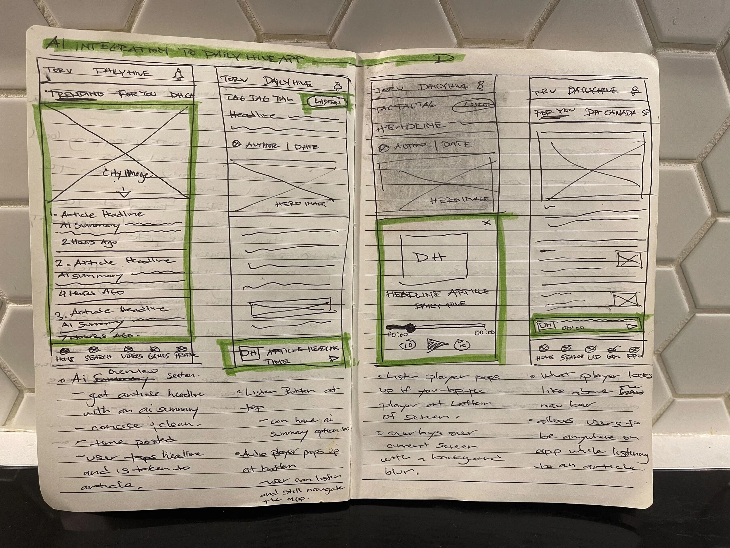
Guided by our research insights, I began with hand-drawn sketches to explore content hierarchy, navigation, and overall flow. These low-fidelity explorations helped validate early assumptions before moving into Figma, where I developed greyscale wireframes focused on layout, copy, and functionality. Collaborating closely with stakeholders and developers, I iterated through several rounds to ensure the experience balanced editorial goals, user needs, and technical feasibility.
Key Design Decisions
Once the greyscale wireframes were validated with the team, I transitioned into high-fidelity design — focusing on visual hierarchy, color, and typography to bring the Daily Hive brand to life within a clean, modern interface.
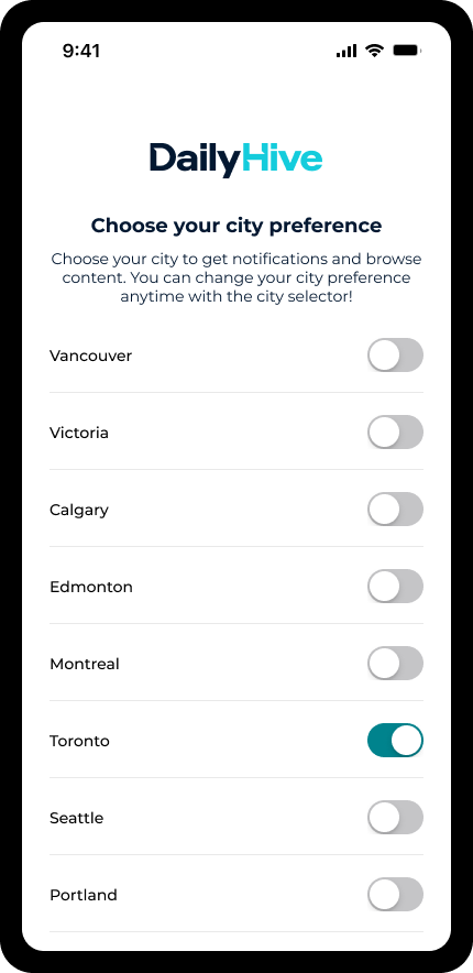
1. Login & Onboarding
The onboarding flow was designed to personalize each user’s experience from the start.
New users can create a Daily Hive profile, select their preferred cities, and choose notification topics — from sports and travel to local news.
This creates a more relevant, tailored app experience, while also allowing Daily Hive to better understand audience interests and engagement patterns.
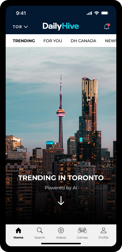
2. AI-Powered Features: Trending & Audio Articles
In collaboration with our Chief Revenue Officer, we explored how AI could enhance both content discovery and accessibility:
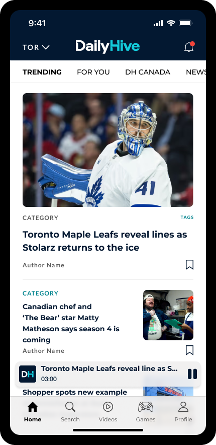
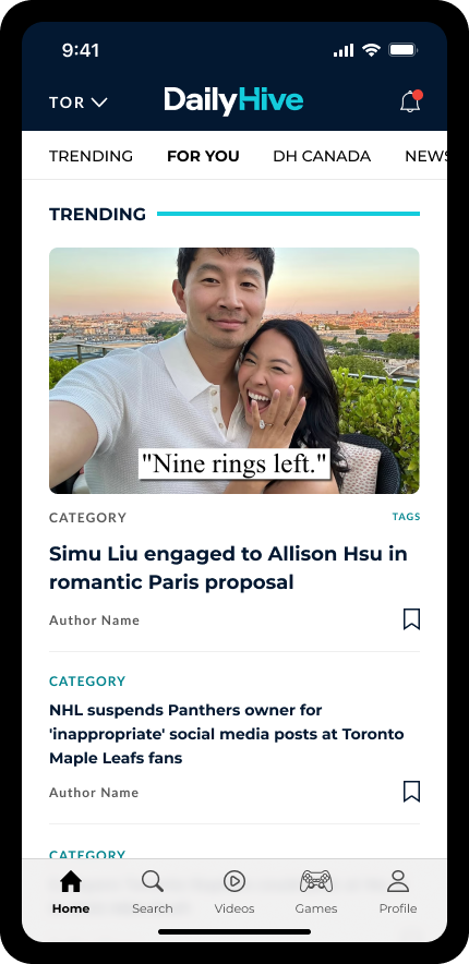
The Trending section uses AI to surface the top 10 most popular stories in each city, keeping the feed dynamic and data-driven.
AI-powered audio articles transform written pieces into listenable formats, allowing users to consume content hands-free while commuting or multitasking — increasing accessibility and retention.
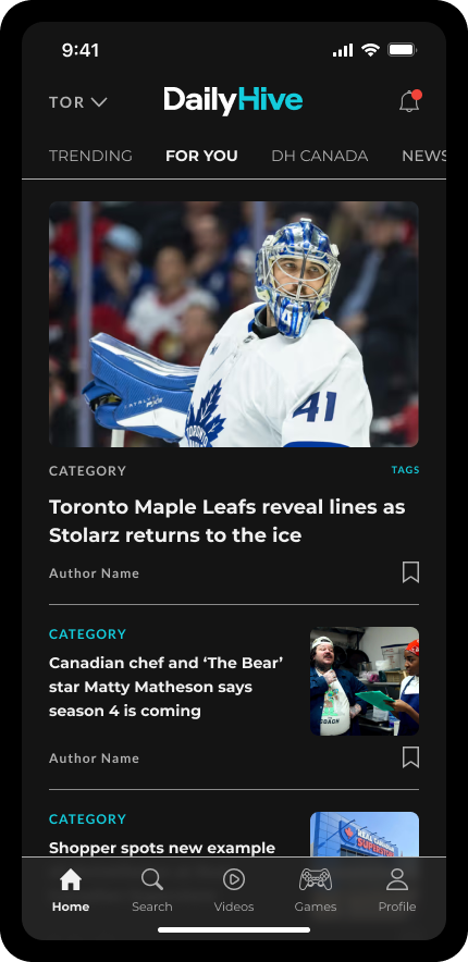
3. “For You” Feed
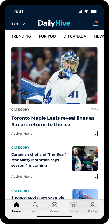
The For You section delivers a completely personalized content stream based on user preferences, followed authors, and reading history.
This area serves as the user’s “home base,” presenting only the stories that matter most to them and reinforcing Daily Hive’s shift toward relevance over volume.
4. Search
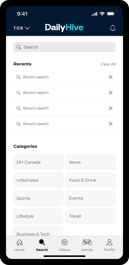
To improve content discoverability, I designed a streamlined search experience that allows users to find stories, topics, or authors quickly through keyword search and predictive suggestions.
5. Video Experience
Daily Hive’s rich video content — from Dished (food and drink) to Offside (sports) — needed a dedicated in-app experience.
We designed a vertical video feed inspired by modern short-form platforms, where users can seamlessly swipe between videos. After viewing, the player minimizes and continues in a floating state, maintaining continuous engagement without interrupting browsing.
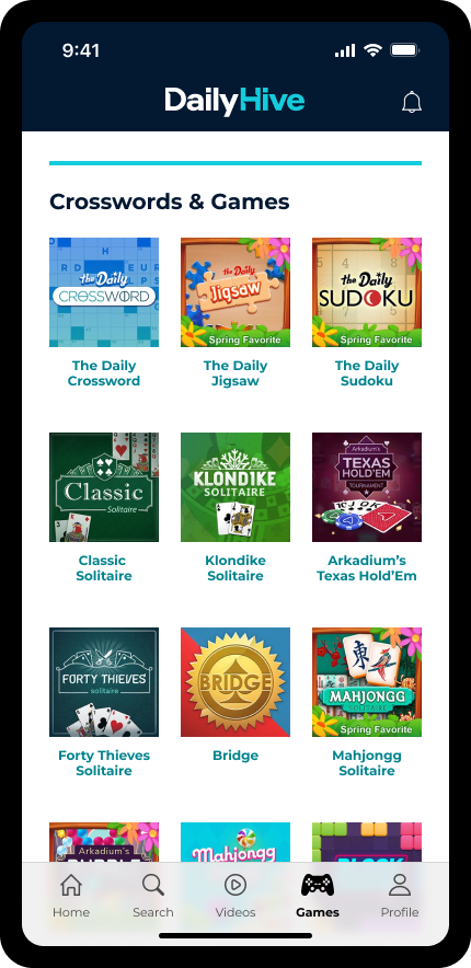
6. Games
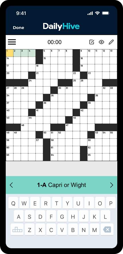
Daily Hive already hosts games on the website, but they’re underutilized.
We saw this as an opportunity to extend session duration and build community engagement. The mobile app introduces a dedicated Games section, with a long-term vision to develop original, in-house experiences — similar to The New York Times’ Wordle.
7. Profile
The Profile section gives users full control over their experience — managing notifications, following preferences, and accessibility settings like text size. It also centralizes account management tasks (passwords, emails, etc.) for a more cohesive, user-friendly setup.
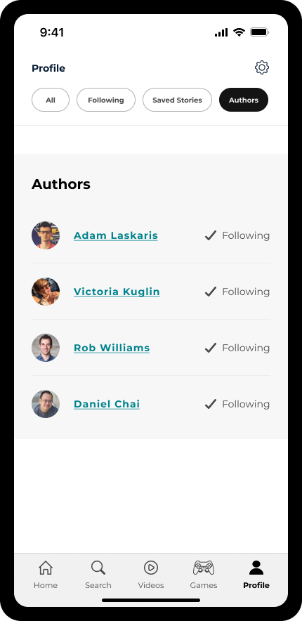
8. Author Following
Beyond topic preferences, users can follow their favourite writers and get notified whenever those authors publish new content.
This feature deepens reader loyalty and creates stronger connections between journalists and their audiences.
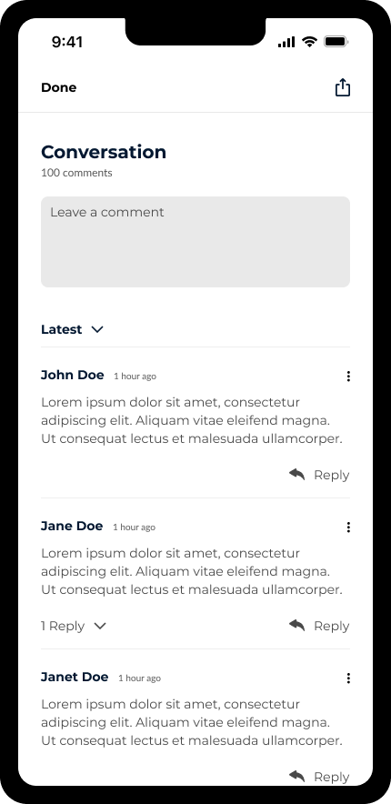
9. Conversations
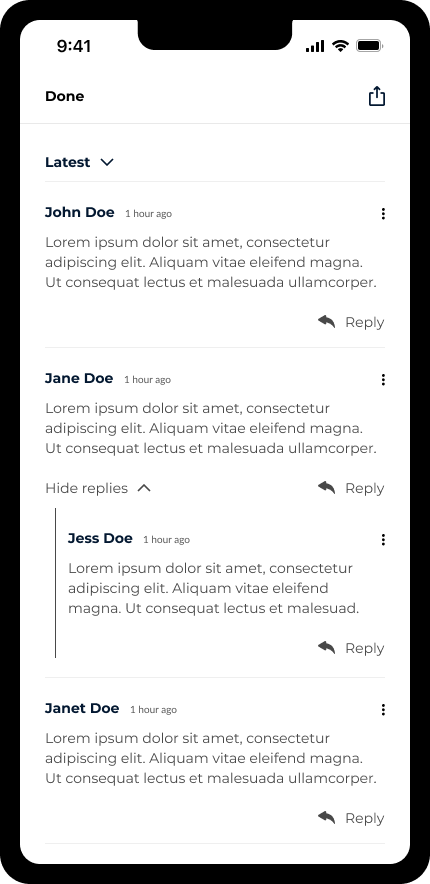
To foster community interaction, we introduced a Conversations feature where users can comment on articles, reply to others, and participate in discussions around trending topics.
This transforms Daily Hive from a one-way content feed into an interactive community platform.
10. Dark Mode
To make the Daily Hive iOS app feel more seamless and personalized, I designed the interface to automatically reflect the user’s preferred system display mode — whether light or dark. This ensures that the app adapts instantly to a user’s iPhone settings without requiring manual toggles, creating a consistent and device-native experience.
Outcome of the Design Phase
These decisions collectively shaped an experience that’s personalized, accessible, and community-driven — while strategically positioning Daily Hive for a future where owned engagement channels are more critical than ever.
EXPECTED IMPACT & VALIDATION
Although the Daily Hive iOS App is still in development, early testing and stakeholder feedback have helped us project how the app will impact both user experience and business outcomes.
Expected outcomes include:
• Higher direct engagement: More readers accessing Daily Hive directly through the app, reducing reliance on Google and Meta traffic.
• Increased repeat visits: Personalized notifications and a cleaner reading experience encouraging daily use.
• Improved perception of the brand: A smoother, faster, and ad-light app experience reinforcing Daily Hive as a trusted, modern media source.
To measure post-launch performance, we’ve aligned with stakeholders on key success indicators:
App Downloads (iOS)
Target: 50,000 in first 6 months
Why it matters: Gauge initial adoption and audience reach
Push Notification Opt-In Rate
Target: >25%
Why it matters: Measures value perception and trust
Daily Active Users
Target: +30% over web baseline
Why it matters: Tracks engagement and repeat usage
Session Duration
Target: +20% increase
Why it matters: Indicates deeper content engagement
App Store Rating
Target: 4.5+
Why it matters: Reflects overall user satisfaction
EARLY FEEDBACK
Even pre-launch, we gathered feedback from internal demos and design reviews:
Editorial and leadership teams appreciated the “clean, premium feel” and “strong alignment with the brand.”
Internal testers noted how the city-based personalization and dark mode made the experience feel “tailored” and “modern.”
Revenue and product teams saw the app as “a major step toward independence from third-party platforms.”
NEXT STEPS
Conduct beta testing with a closed group of readers.
Gather usability and performance data once the app is live.
Use insights to refine onboarding, notification strategy, and content personalization.


