
blogTO Email Capture
PROJECT OVERVIEW
blogTO is Toronto’s leading digital publisher, covering the city’s food, culture, and local news with a focus on what’s trending and what’s next.
In response to the growing instability of traditional traffic sources — with AI disrupting search, Google Discover proving inconsistent, and Meta no longer distributing news content in Canada — blogTO launched a strategic initiative to strengthen its direct audience relationships. The goal: to increase newsletter sign-ups and grow our owned email list by implementing a dual-layer email wall system.
My Role
Senior UX/UI Designer
Team
Worked closely with our Chief Content Officer, Chief Revenue Officer, Vice President of Digital, Vice President of Consumer Marketing, and Director of Editorial.
Timeline
July - October 2025
Tools Used
Designs / Mockups done in Figma by me
Handed off for development in Omeda.

CHALLENGE
With search, social, and algorithmic referrals collapsing or shifting, publishers are struggling to get traffic from traditional platforms.
There are big shifts (our pain points) how people are finding content today:
1. AI is changing search behaviour
People are using AI tools (like ChatGPT, Perplexity, etc.) instead of Google Search to get information — which cuts publishers out of the loop, since they rely on search traffic to bring readers to their sites.
2. Google Discovery is unreliable
While Google Discover (the personalized news feed on Android/Chrome) can drive huge traffic spikes, it’s unstable and unpredictable — so publishers can’t depend on it long-term.
3. Meta no longer drives traffic
Meta has stopped prioritizing news content, and in Canada, there's also the added complication of Bill C-18, which led Meta to block news entirely. So publishers lost a huge referral source.
*Bottom line is that traditional traffic sources are drying up*
What would success look like?
The current blogTO experience lacks a consistent system for actively capturing user emails. A streamlined approach to email acquisition will help us maintain a steady weekly email capture rate helps us build strong, owned email lists — essential for driving repeat visits, promoting content, and improving monetization.
RESEARCH & DISCOVERY
To guide our decision-making around gating content with email walls, we relied on a mix of qualitative and observational research:
1. Behavioural Analytics
We analyzed user flows, scroll depth, and bounce rates to identify loyal repeat visitors vs. casual browsers.
2. Comparative UX Audits
Reviewed how other publishers implement email gates and paywalls.
3. Internal Experiments
Piloted the email wall on blogTO to test friction, drop-off, and conversion rates in real time.
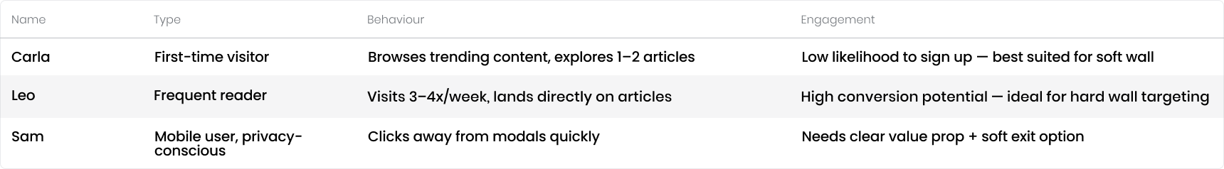
User Personas
Following our research and analysis of key user pain points, we developed a set of simple user personas to guide our solution and ensure it addressed the needs and behaviours of our core audiences.
IDEATION & DESIGN PROCESS
Using our research insights and identified pain points, I created a first round of greyscale wireframes to explore layout, copy, and functionality in collaboration with the team.
Key Design Decisions
To support our growing need for direct audience engagement — particularly as traditional traffic sources like search and social become less reliable — we implemented two types of email capture overlays for this campaign: a soft wall and a hard wall.
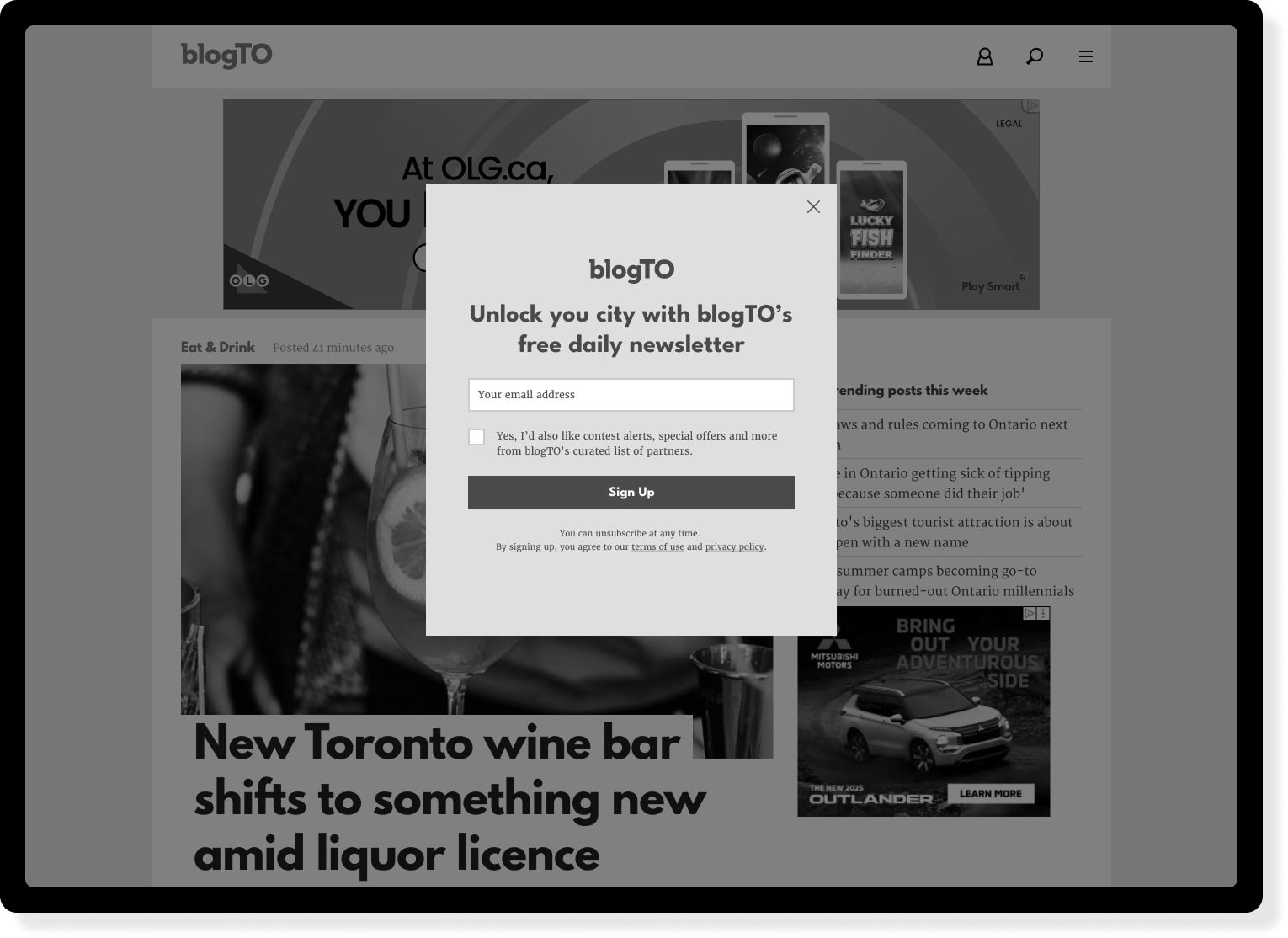
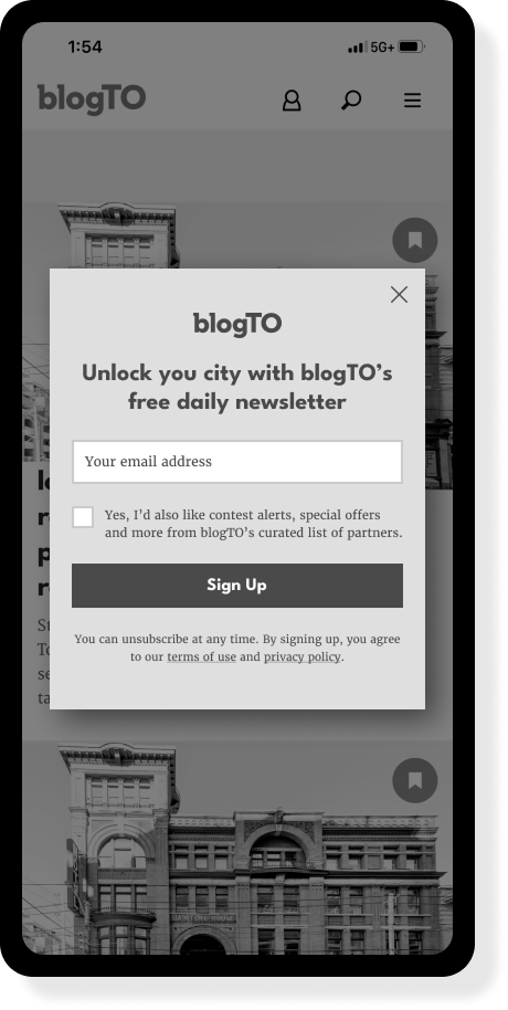
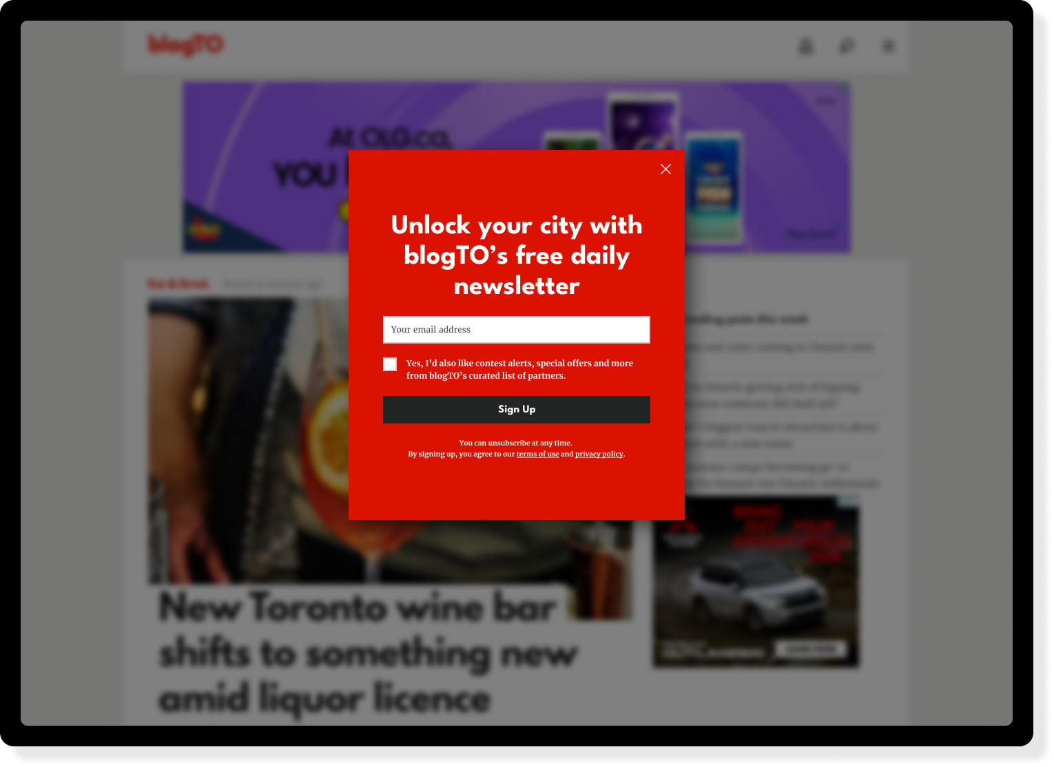
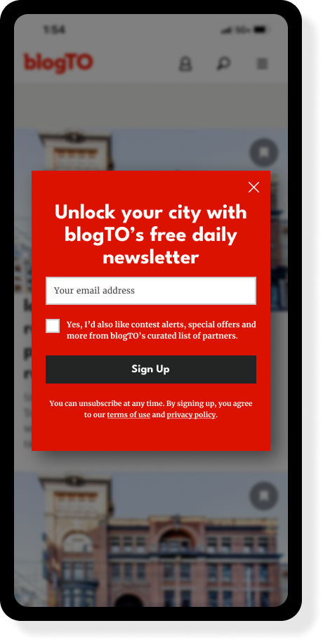
Soft Wall (home page prompt)
Purpose: Light-touch engagement for casual or first-time visitors.
Design: A non-blocking modal that appears on the homepage, inviting users to sign up for our newsletter.
User Experience: Users can easily dismiss the prompt by clicking the “X” or anywhere outside the modal, with no disruption to their browsing.
Rationale: This approach gently surfaces the newsletter value proposition without interrupting the user journey — ideal for top-of-funnel awareness.
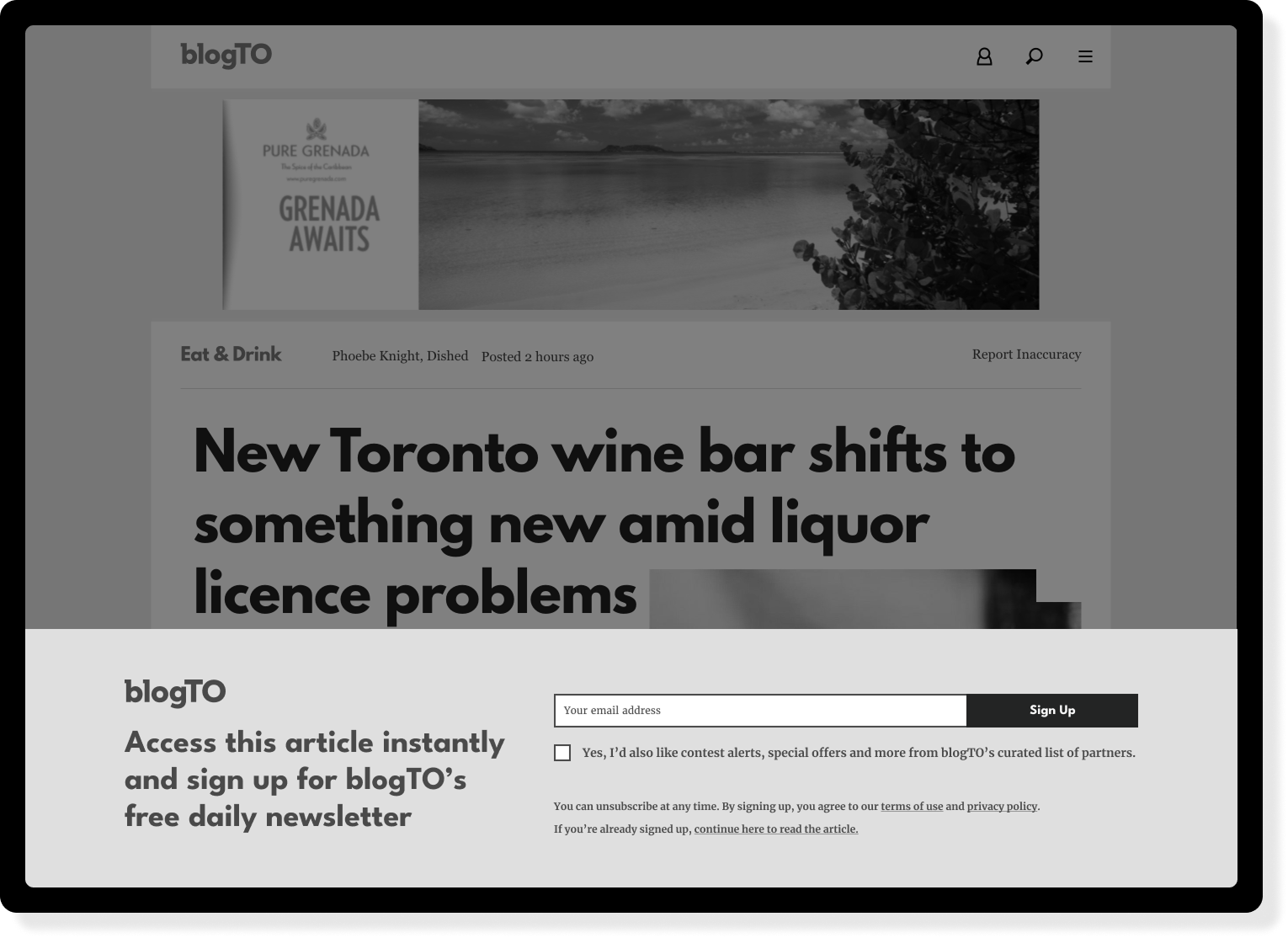
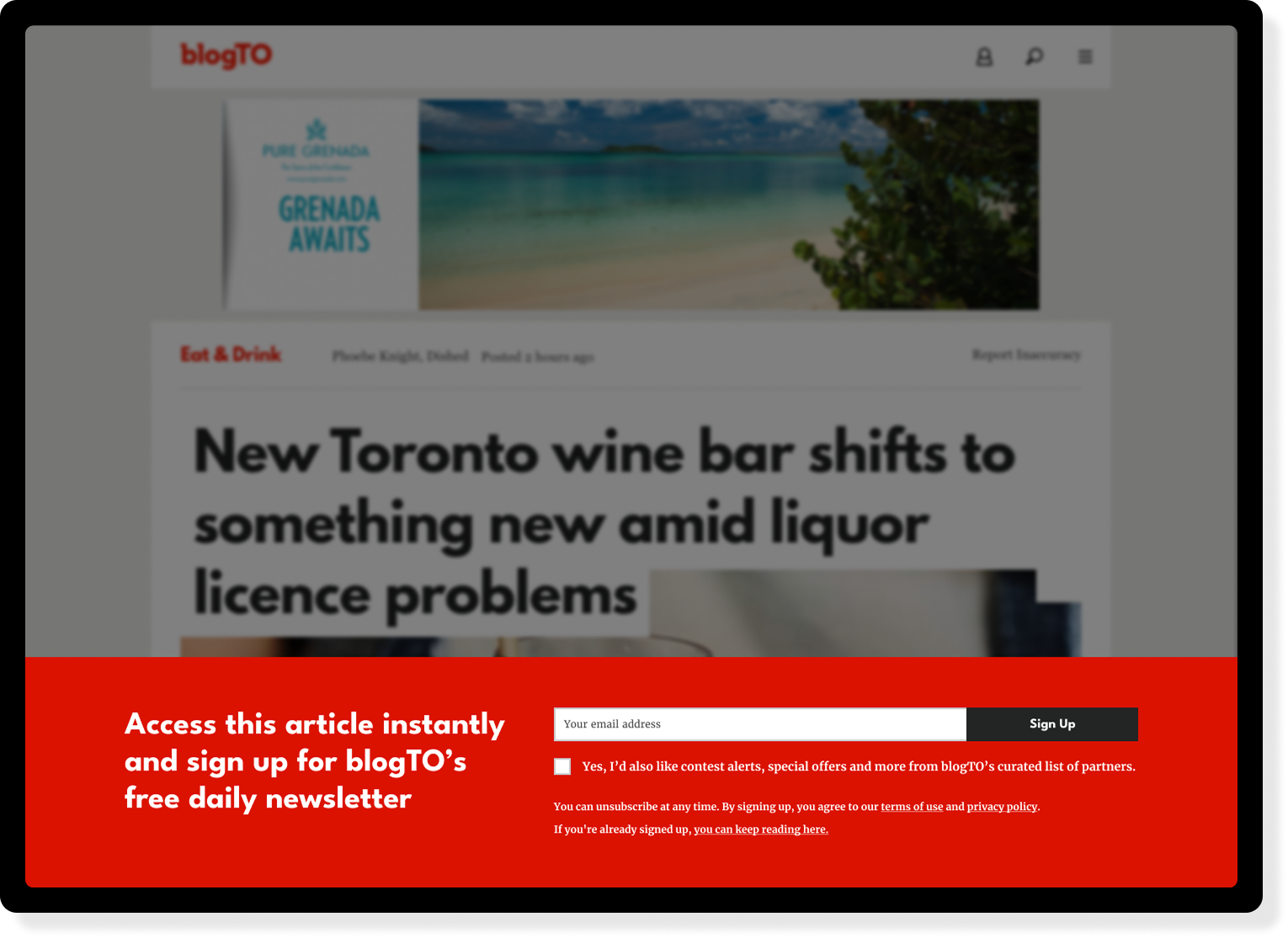
Hard Wall (content paywall)
Purpose: High-intent capture tool for loyal or returning visitors on specific content.
Design: A full-screen overlay triggered on selected articles that requires user action to continue reading.
Conversion Mechanism: Users must enter their email address (and can optionally opt in to marketing) to unlock the content — or be redirected to the homepage.
User Control: A discreet “continue without signing up” link is included to allow bypassing, inspired by best practices seen at Audiencers conferences.
Rationale: This wall mimics a “value exchange” model — treating access to premium or high-value content as worth an email address — while still preserving a respectful user experience through subtle exit options.

FINAL DESIGNS / SOLUTION
Through multiple iterations focused on copy refinement, functionality updates, and layout adjustments for Omeda compatibility, we finalized a solution that met both user experience and technical requirements.
Soft Wall
Hard Wall

RESULTS / IMPACT
After implementing this solution, we have seen a 4% conversion rate for users who see the wall
That means we’re gaining 2,000 new email subscribers per week, which is a strong result for a niche/local publisher
Downsides of the implementation have been limited (user frustration, bounce rates) so we’re planning on expanding gates tests to our other brands like Daily Hive and Curiocity
Daily Hive Email Capture


LEARNINGS
What went well?
Strong Conversion Performance: The hard wall delivered a 4% conversion rate, adding ~2,000 new email subscribers per week — outperforming early expectations for a content gate.
Positive Engagement from Loyal Users: Users who already had strong intent or brand familiarity were willing to engage with the wall, validating our audience segmentation strategy.
Soft Exit Option Reduced Friction: The addition of a subtle "continue without signing up" link helped preserve user trust while still driving conversions.
What challenges did you face?
Balancing User Experience vs. List Growth: It was difficult to walk the line between growing our list aggressively and not alienating users with too much friction.
Messaging Clarity: Early versions of the wall lacked a strong value proposition for signing up, which initially led to lower engagement rates.
Content Targeting: Determining which articles were "high enough value" to place behind a hard wall required trial and error.
What would you do differently?
Test More Aggressive Copy Variants: Messaging can make or break conversion. In future iterations, we’d A/B test more persuasive language that communicates what subscribers get in return.
Personalize the Experience by Visitor Type: Dynamically adapting the wall based on user behavior (e.g., return frequency or traffic source) could improve targeting and UX.
Segment Follow-Up Emails More Carefully: After sign-up, users were added to general lists — next time, we'd align onboarding flows with content interests from their initial visit.
Next steps
Building on the success of blogTO’s email capture campaign, we’re extending this strategy throughout our digital network — starting with Daily Hive and Curiocity.